Start with the silhouette
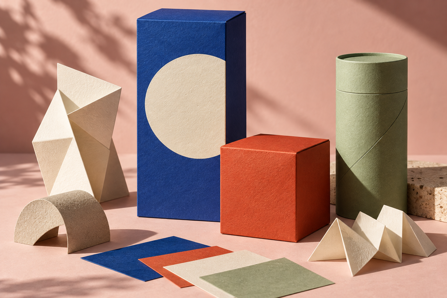
Before a word is read, a pack occupies space. A tall carton, a short box and a paper tube already carry different proportions. The opening study uses those differences as part of the composition: the tall blue surface is a pause, the low red box is an anchor and the green tube introduces a curved edge.
This is a concept study, rather than a photographed retail launch. Its value is in the decisions it makes visible. Give the biggest face one clear job and let the secondary forms support it. A package does not need more elements simply because there is room to add them.
A palette needs jobs, not just swatches
Choose a lead colour for recognition, a supporting colour for distinction and a quiet surface for the information that must be read. Then test the roles across sizes. A colour that works as a tiny accent can feel aggressive when it covers a large mailer.
Think about the range as a group of objects. If every variant changes its type, composition and colour at once, the customer has to learn the brand again on every pack. Keep a stable element and let one signal do the work of separating flavours, sizes or formulations.
Move the artwork around the object
Flat layouts hide some of the most interesting relationships. A circle can meet a fold, a band can continue around a corner, and a block of colour can make a lid feel like a separate piece. Check those choices on the assembled form before deciding they work. A convincing front panel is only the beginning.
Try a deliberately small experiment
Make three versions of the same structure. In the first, change only the dominant colour. In the second, keep the palette and change scale. In the third, move the key graphic across a fold. Compare them at thumbnail size and at the size of the actual object. The exercise is useful precisely because it prevents everything changing at once.
A small colour experiment
Change the emphasis. The same proportions can suggest a different range.